The challenge
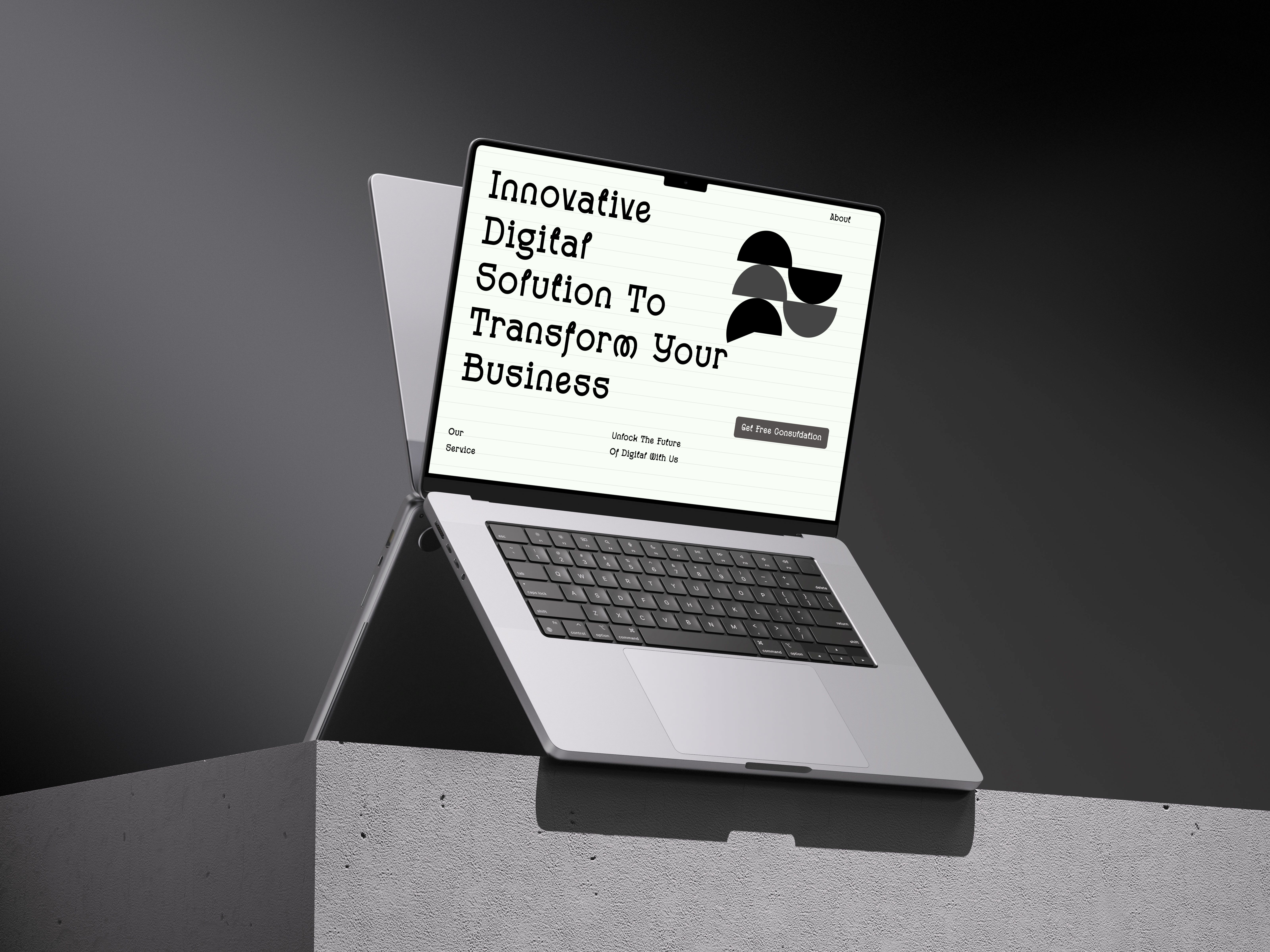
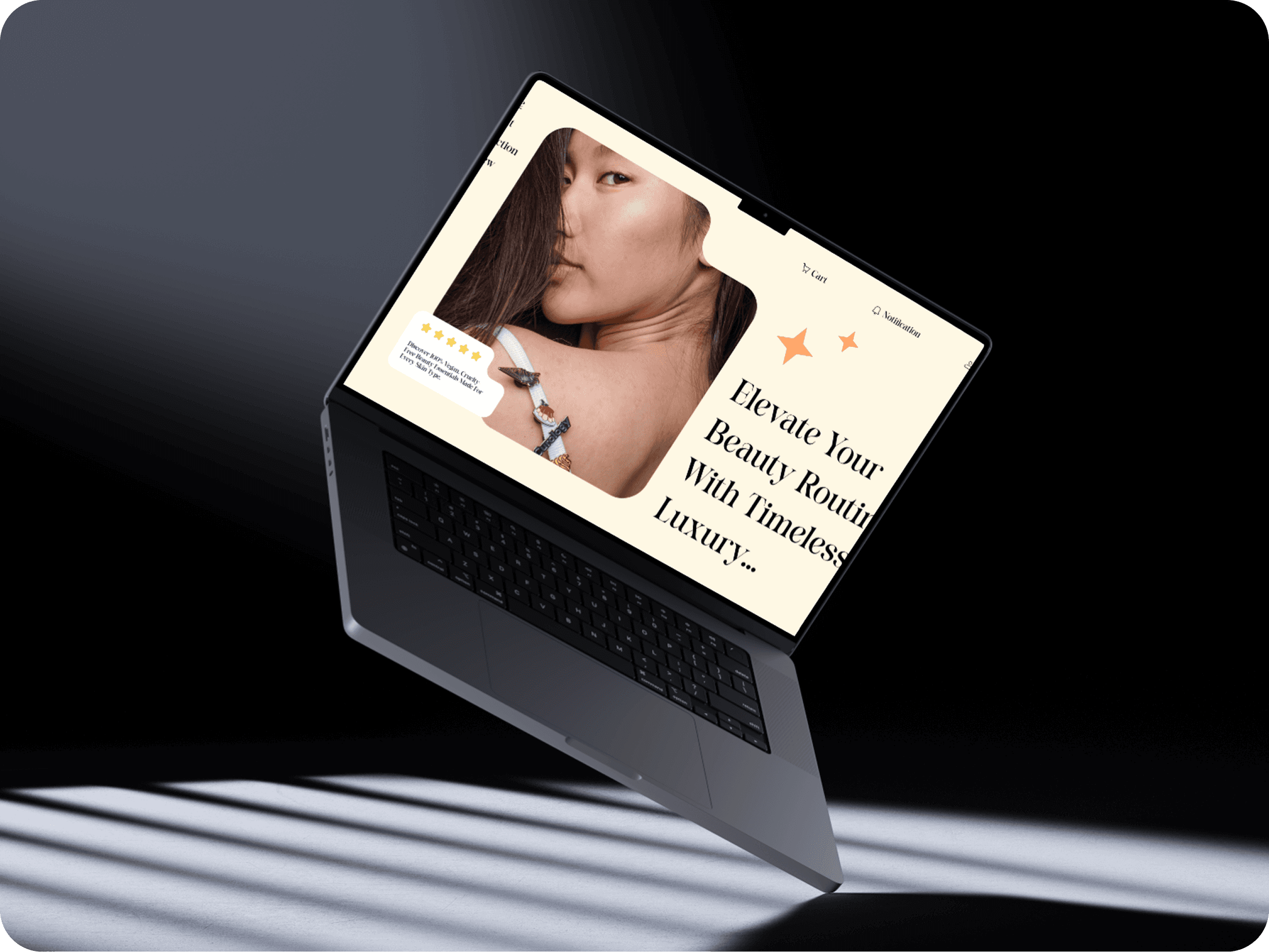
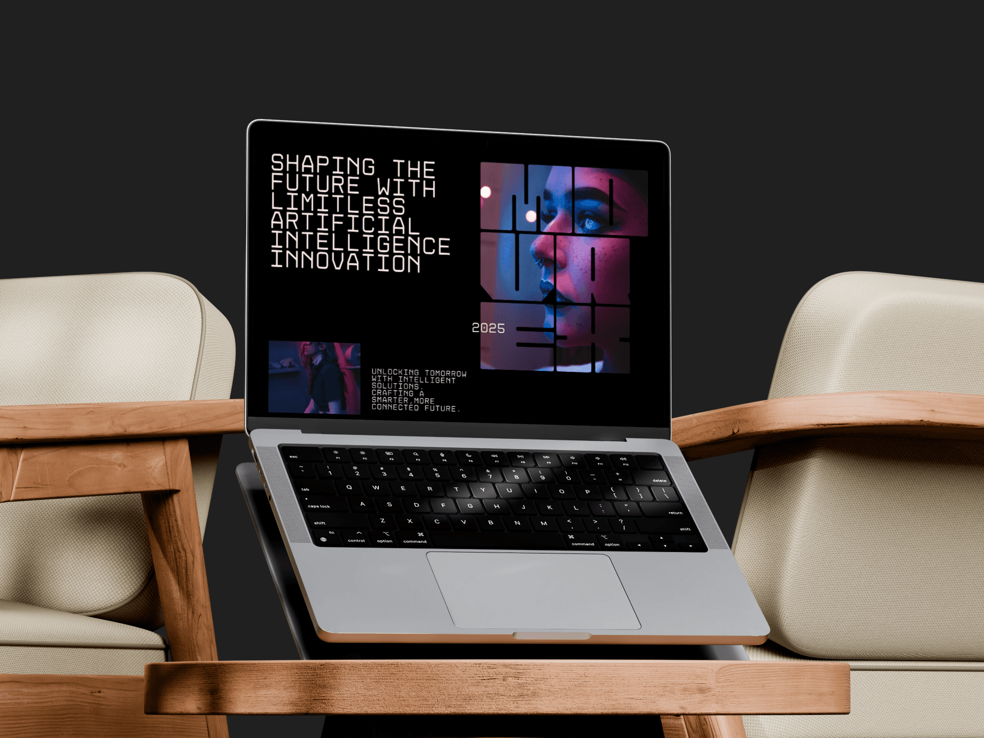
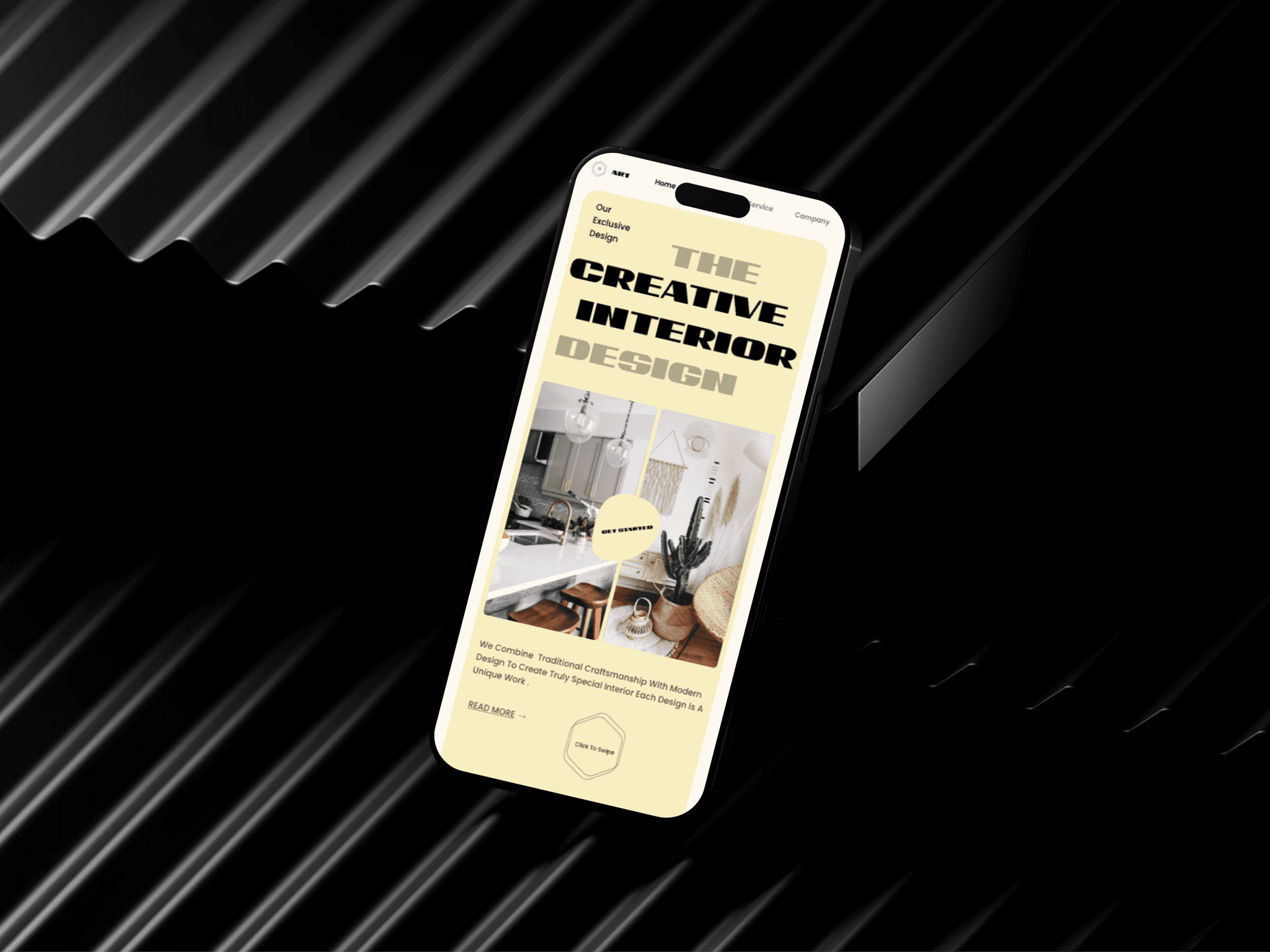
The layout is being redesigned without changing the content in both design and development. An asymmetric modern layout with 50+ unique multi-headers is introduced, creating a dynamic and visually engaging experience. The responsive structure is modified based on target breakpoints while maintaining code parity for consistency across devices.
Duration
4 Weeks


The Solution
Balancing Visual Appeal & Usability: Ensuring the asymmetric layout remained intuitive and easy to navigate without overwhelming users. Responsive Adaptation: Designing a layout that maintains its unique structure while scaling effectively for different screen sizes. Consistency Across Breakpoints: Avoiding a fragmented experience when transitioning between desktop, tablet, and mobile views.

The Result
A visually compelling interface that enhances engagement. Smooth adaptability across devices while retaining its modern asymmetric aesthetic. A distinctive UI identity, making the platform stand out while ensuring usability